Page 1: Responsive Web Page Tutorial, HTML/CSS Only
Page 2: Page Structure using Flexbox and a Media Query
Page 3: Footer (nested flexboxes)
Page 4: Header (menu/search toggles, transition effects)
Page 5: Sticky Aside
Page 6: Make it Beautiful
Page 7: JavaScript Efficiencies, Breadcrumbs, Cats, Audio and More
Page 8: Embedded Note from Creator and Floating Hearts
Page 9: Move On To, Video Tutorial
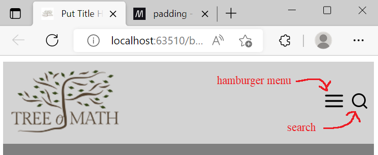
Header: Menu/Search Toggles, Transition Effects
The header has a logo, links, and search. On small screens, a ‘hamburger menu’ (triple bar icon) gives access to the links. There are transition effects when opening/closing the menu and search, for an improved user experience.
(1a) Small screens, initial display:
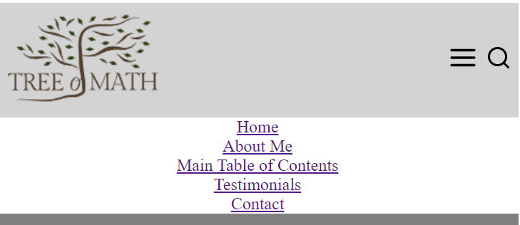
(1b) Small screens, hamburger menu open:
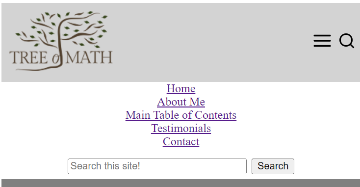
(1c) Small screens, menu and search open:
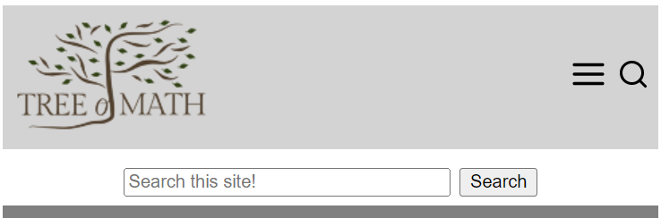
(1d) Small screens, search only open:
(1e) Wider screens, hamburger menu gone, links wrapping:

(1f) Widest screens, search open:

Code Chunk 4 replaces the <header></header> container in
Code Chunk 2. Only skeleton code is given below; actual
links and icons were inserted for the images above.
                    <header>

                      <div id="headerLogo">logo</div>

                      <nav id="headerNav">

                        <a>link1</a> <!-- repeat line as needed -->

                      </nav>

                      <div id="headerHamburgerIcon">

                        <img onclick="toggle('headerNavMobileOnly','flex');"
                    src="source" />

                      </div>

                      <div id="headerSearchIcon">

                        <img onclick="toggle('headerSearchForm','block');"
                    src="source" />

                      </div>

                    </header>

                    <nav id="headerNavMobileOnly">&nsbp;</nav>

                    <script>

                      document.getElementById('headerNavMobileOnly').innerHTML = document.getElementById('headerNav').innerHTML;

                    </script>

                    <form id="headerSearchForm" style="display:none;">

                      <!-- search form contents -->

                    </form>
                    <script>

                    function toggle(theID,attributeToToggle) {

                       var theElmt = document.getElementById(theID);

                       if (theElmt.style.display === "none") {

                         theElmt.style.display = attributeToToggle;

                       } else {

                         theElmt.style.display = "none";

                       }

                    }

                    </script>
Here's CSS styling for Code Chunk 4:
More CSS styling for Code Chunk 4:
Notes on Code Chunk 4 and its CSS:
-
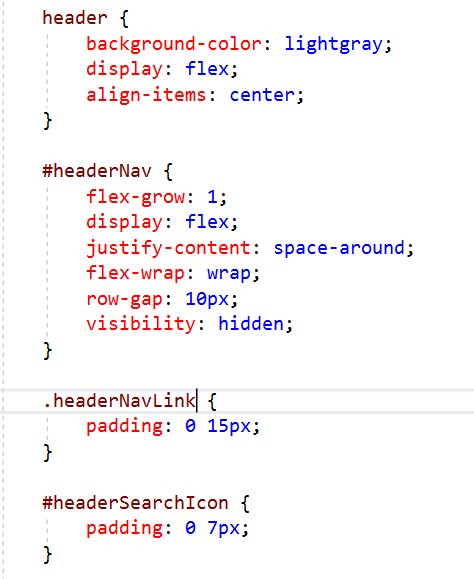
The
headerflexbox has four flex-items:
Theheaderflexbox has four direct children (headerLogo,headerNav,headerHamburgerIconandheaderSearchIcon), centered (align-items:center;) in the height provided by the logo. The divheaderNavtakes all extra horizontal space (flex-grow: 1;) but is initially hidden (visibility: hidden;), since this is a mobile-first design. See image 1a. -
visibility:hidden;versusdisplay:none;
The CSSvisibility:hidden;hides contents, but keeps the space occupied by the contents. Since the space allotted toheaderNavis preserved, the menu and search icons are pushed to the right side of the screen, as desired. For comparison,display:none;completely removes an item from the document flow. Had we useddisplay:none;as the initial value forheaderNav, then the icons would have smushed up next to the logo. -
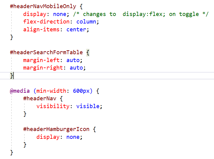
Wider screens:
For wider screens,headerNavbecomes visible (visibility:visible;). At the same time, the hamburger menu icon disappears (display:none;). By removing the space originally occupied by the hamburger menu icon, the links are more perfectly centered between the logo and search icon. The CSSflex-wrap:wrap;androw-gap:10px;allow theheaderNavlinks to occupy two rows (as needed), with some extra vertical space between the rows. See image 1e. -
Padding shorthand:
Whenpaddingtakes two values, then the first is used for top/bottom padding, and the second for left/right padding. Padding the left/right ofheaderNavLinklinks guarantees there will always be a reasonable space between them (that is, they won't get too close together), and also causes them to wrap into two rows earlier than they would otherwise. The padding onheaderSearchIcongives a nice buffer between the right margin and the hamburger menu icon. -
Two divs below header:
Below the<header></header>container, there are two divs:-
headerNavMobileOnlydisplays the header links when the hamburger menu is clicked; in the code, it contains only a non-breaking space ( ) -
headerSearchFormdisplays the search box when the search icon is clicked
-
-
Don't type repeated content!
The contents ofheaderNavandheaderNavMobileOnlyshould be identical—the links just appear in different locations in the HTML document and are styled differently. Identical content in two or more places in an HTML document can be a nightmare to maintain—it's too easy to forget that you have to make the same edits in more than one place. By using JavaScript to automatically copy the contents from one div to another, the problem is solved:
<script>Here, the contents (
document.getElementById('headerNavMobileOnly').innerHTML
= document.getElementById('headerNav').innerHTML;
</script>
innerHTML) ofheaderNavare grabbed, and then assigned to theinnerHTMLofheaderNavMobileOnly. This script could go in many different places in the HTML document, but I prefer to keep it close to the location where it is used. -
Google custom search form:
Google provides a free Programmable Search Engine , so users can easily find information on your personal website. My site has hundreds of pages, so this is a valuable resource. It's easy to set up: just embed the code that Google gives you wherever the search box should appear.
For us, the search box is only displayed when the search icon is clicked, hence the initial CSS:For some (unknown) reason, I got correct toggle behavior only when I putdisplay:none;display:none;in the actual form (instead of with the CSS in the head). Expect some quirks every now and then when designing web pages! -
Toggle function:
Thetogglefunction makes the menu/search sections appear/disappear upon successive clicks of the corresponding icons. Again, the script can go in many places, but I prefer to keep it close to where it is used. -
Centering the search box:
There's a div withid="headerSearchFormTable"insideheaderSearchForm, but it isn't shown in Code Chunk 4. The CSSmargin-left:auto;andmargin-right:auto;centers the search box horizontally in the available space. -
Free SVG icons:
There are places where you can get free SVG (Scalable Vector Graphics) icons with transparent backgrounds, with no attribution required. Do a web search!
Transition Effects
When things (like menus and search boxes) appear and disappear instantly, it can be a bit disorienting to a user. It's a much better user experience if things appear/disappear gradually—enter CSS transitions.
For example, to make the green square appear/disappear instantly, click here. A bit disconcerting, isn't it?
For comparison, make it fade in/out by clicking here. Isn't that a little easier on the eyes?
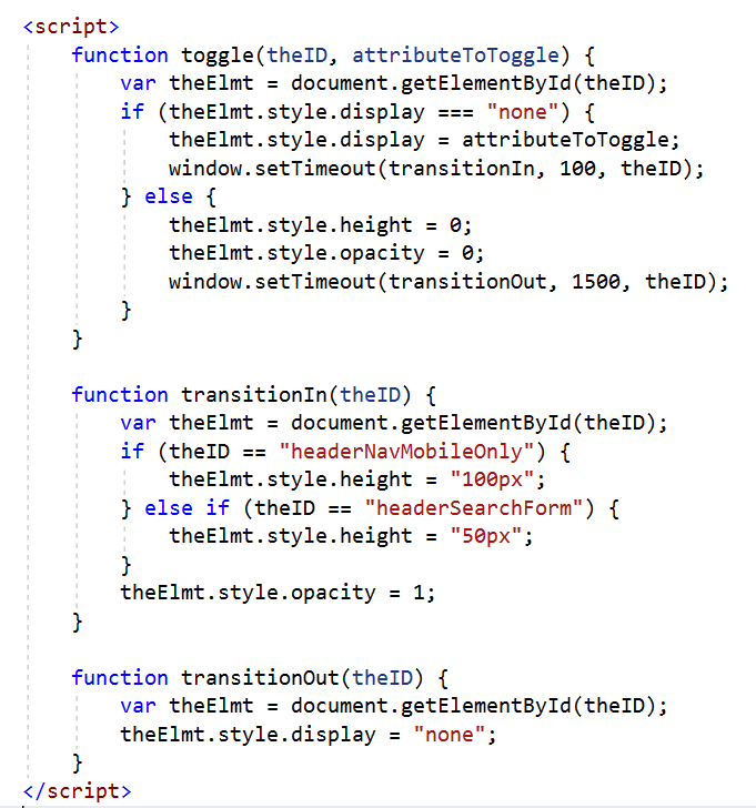
To make our menu items and search box have a similar fade in/out effect, replace the previous
toggle function and add two new functions,
transitionIn and transitionOut:
Also add the new CSS:
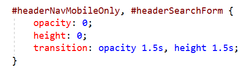
A CSS transition can be coded as: transition: attribute1 time1, attribute2 time2;
A CSS transition is applied whenever a specified attribute is changed.
For example, whenever the value for opacity is changed,
then it will transition from the current value to new value in 1.5 seconds.
For us, the value is changed when (say) the hamburger menu is clicked, causing the
toggle function to be called.
Lurking in the background, there is a
transition-timing-function
that describes the rate at which a numerical value changes (like opacity going from 0 to 1).
The default transition-timing-function is ease, which is
equivalent to
cubic-bezier(0.25, 0.1, 0.25, 1.0).
The thing that's tricky here is the ‘setTimeout’ stuff. Transitioning to/from
display:none; is known to be problematic (search for ‘display: none’
on this page).
We need to insert some brief pauses
to assure that things work as expected. Here's the logic:
-
To make (say) the menu fade in, a click on the hamburger icon first sets
displayto ‘flex’. Then, pause 100 milliseconds before setting the opacity to 1, and the height to 100px. Without the pause, it won't work. -
Note that in
the input parameter forwindow.setTimeout(transitionIn, 100, theID)transitionInis the third parameter forsetTimeout. -
To make the menu fade out, a subsequent click on the hamburger icon first sets the opacity and height to 0.
Then, we wait 1500 milliseconds (1.5 seconds) for the transition to happen, before
setting
displayback to ‘none’. Without the pause, it won't work.
The Responsive Web Page, So Far!
Here's our responsive web page thus far. Change its size and watch the header/footer/main sections respond accordingly. Click on the hamburger menu and search icon. There has been no professional styling yet; we've only put in enough CSS to make things work.