Page 1: Responsive Web Page Tutorial, HTML/CSS Only
Page 2: Page Structure using Flexbox and a Media Query
Page 3: Footer (nested flexboxes)
Page 4: Header (menu/search toggles, transition effects)
Page 5: Sticky Aside
Page 6: Make it Beautiful
Page 7: JavaScript Efficiencies, Breadcrumbs, Cats, Audio and More
Page 8: Embedded Note from Creator and Floating Hearts
Page 9: Move On To, Video Tutorial
Footer: Nested Flexboxes
The footer is easier than the header, so is coded first. This provides additional practice with flexbox and media queries. JavaScript will be used to get automatically-updated ‘last modified’ and copyright dates.
The footer has a logo on the left, with several adjacent links/info, which stack up (vertically) next to the logo on small screens. On wider screens, the links/info are equally-spaced across the width. See the images below.
For small screens:

For wider screens:

In earlier CSS, we had styled: header, footer.
Separate the footer into its own CSS declaration, keeping only the background-color.
Code Chunk 3 (below) replaces the <footer></footer> container in
Code Chunk 2. I've put in realistic-length links
and my actual logo to better see the footer behavior.
<footer>
<div id="footerLogo">logo</div>
<div id="footerLinkContainer">
<div id="footerLastModifiedContainer">
<div id="footerLastModified1">Last Modified: </div>
<div id="footerLastModified2">month/day/year</div>
</div>
<div id="footerCopyrightContainer">
<div id="footerCopyright1">© year1–year2 </div>
<div id="footerCopyright2">Dr. Carol JVF Burns</div>
</div>
<div id="footerTermsOfUse">Terms of Use</div>
<div id="footerPoweredByContainer">
<div id="footerPoweredBy1">Powered By: </div>
<div id="footerPoweredBy2">MathJax & JSXGraph</div>
</div>
</div>
</footer>
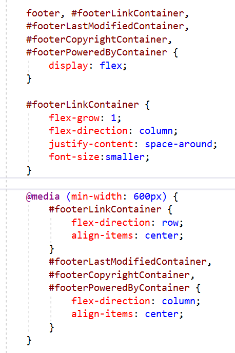
Here's the new CSS styling for Code Chunk 3:
Major and Minor Axes; Justify versus Align
There are two important axes when working with flexboxes: the main axis and the (perpendicular) cross axis. When distributing extra space between/around flex-items, you must be aware of these axes because different CSS instructions are used for each:
-
On the MAIN axis:
justify-contentdistributes extra space. (Possible memory device: Justify the main idea!) -
On the CROSS axis:
align-itemsdistributes extra space.
Important: Both justify-content and align-items control how to distribute
extra space. If any flex-item has flex-grow different from 0, then there won't be any extra space;
in this case, justify-content and align-items won't have any effect.
-
If
flex-directionisrow(the default direction), then the main axis is horizontal (so the cross axis is vertical). -
If
flex-directioniscolumn, then the main axis is vertical (so the cross axis is horizontal).
Notes on Code Chunk 3 and its CSS:
-
Five flexboxes:
There are five flexboxes:footer,footerLinkContainer,footerLastModifiedContainer,footerCopyrightContainer, andfooterPoweredByContainer. -
Footer flexbox:
-
Has two direct children:
footerLogoandfooterLinkContainer. - Takes the default flex-direction, so is laid out horizontally.
-
The flex-item
footerLinkContainerhasflex-grow: 1;so it grows to take up all extra horizontal space.
-
Has two direct children:
-
Design for small screens first:
The flexboxfooterLinkContainerhasflex-direction: column;so its four direct children (footerLastModifiedContainer,footerCopyrightContainer,footerTermsOfUseandfooterPoweredByContainer) are laid out along a vertical main axis. The CSSjustify-content: space-around;provides vertical padding to space the four flex-units nicely inside the fixed height provided by the logo.
Note that the main axis is vertical so we usedjustify-content. -
Single-line info on small screens; double-line on wider screens
Flexboxes are used to toggle between single and double line displays forfooterLastModifiedContainer,FooterCopyrightContainerandfooterPoweredByContainer. The initial code has them single-line, and the non-breaking space ( ) keeps the text from smushing together. (The non-breaking space does affect the subsequent two-line centering slightly, but 99% of people will never notice this.) -
Media query for wider screens:
For wider screens,footerLinkContainerturns into a row. The links/info should be vertically centered (halfway up the tree logo). Since the main axis forfooterLinkContaineris now a row, the cross-axis is vertical. For centering on this cross axis, use:align-items: center;
Notes:-
Without
align-itemsset tocenter, the links/info would be at the top of the tree.
-
The CSS
justify-content: space-around;isn't changed with the media query; in this new horizontal orientation, it spaces the links/info out horizontally.
-
Without
-
Media query to get double-line info/links on wider screens:
For wider screens,footerLastModifiedContainer,FooterCopyrightContainerandfooterPoweredByContainerchange to columns. Now, the main axis for these three containers is vertical, so the cross axis is horizontal. Thus,align-items: center;gives the desired horizontal (cross axis) centering. -
Character Codes:
Note the use of:-
©for the copyright symbol (©) -
–for an en-dash (used for number ranges, like 2003–2020) -
&for an ampersand (&)
-
JavaScript
JavaScript is a programming language that gives web pages lots of functionality not provided by HTML and CSS.
Last modified date
On a big website like mine (with hundreds of pages), I don't want to hand-code the ‘last modified’ date every time
I tweak a page. Instead, put this bit of JavaScript as the contents of the footerlastModified2 div
(in the place of month/day/year):
                <script>

                    document.write(document.lastModified.

                    substring(0,document.lastModified.indexOf(' ')));

                </script>
-
The
<script></script>container is required. In HTML5, the default value istype="text/javascript". -
document.lastModifiedgives themonth/day/year hour:minute:secondwhen a document was last modified. Notice the space separatingmonth/day/yearfromhour:minute:second. -
substring(start,end)extracts a substring (from indicesstarttoend) from a string. The character at indexstartIS included. The character at indexendIS NOT included. -
In JavaScript, indices start at zero. So, the first index of a string is at position 0.
We want to go up to the index of the space, thus capturing just the
month/day/year.
Copyright date range
My footer lists a copyright date range: initial page creation to current year. I certainly don't want to hand-code a new end on hundreds of pages every year.
Put this after the – in footerCopyright1
(in the place of year2):
<script>document.write(new Date().getFullYear())</script>