Tutorial: Designing a Responsive Web Page
(HTML and CSS only)
What is the purpose of this page?
A responsive web page looks good on all devices—like desktop computers, tablets, and phones.
This tutorial codes a simple responsive web page from scratch, using only HTML, CSS and JavaScript. The web page has these features:
- header: logo, navigation (general site links)
- main body: side navigation (primarily in-page needs), main content
- footer
The page benefits from styling by a professional web designer (Dabaman at Envato).
Here's a link to the completed responsive web page. Use Responsinator to see how the page looks on lots of different devices.
With the techniques/tools presented here, you can design other page layouts. I wrote this tutorial in 2022, while making my site responsive (after more than two decades of fixed-width design). Several weeks were spent contemplating the use of various responsive frameworks (like Bootstrap and W3.CSS). However, I ended up creating—from scratch—just the responsive elements that my site needs. I put these tutorial pages on the web with the hope that others might benefit from my work.
Primarily, I wrote this series of lessons for myself, so I can remember the research and decisions that went into the design of my responsive page. However, I put it on the web in the hope that it might also be useful to some of you!
Prerequisites
In order to benefit fully from this tutorial, it will be helpful to have:
- some HTML (HyperText Markup Language) coding experience (W3Schools HTML tutorial)
- some CSS (Cascading Style Sheet) experience (W3Schools CSS tutorial)
- some JavaScript experience (W3Schools JavaScript tutorial)
- an editor for writing HTML/CSS code (I use Visual Studio; a free version is available)
- a way to preview the code you write (this is built into Visual Studio)
If you're just playing around, then you can write your HTML code using any simple text editor (like Notepad on Windows).
However, you must save your file with a ‘.htm’
or ‘.html’ extension.
Then, just drag your file into a browser (like
Chrome,
Safari, or
Edge) to see the results.
Skeleton/Template for a Responsive HTML Page
- In this tutorial, code is shown with a light grey background (see below). Images are included to show what the page looks like after each chunk of new code is added.
- Some items are numbered (1), (2), ... for ease of reference.
- You can copy-and-paste code into your editor. Of course, you'd then need to remove the line numbers. Even though it takes a bit longer, there are learning benefits from typing everything in yourself!
- HTML is largely case-insensitive (not sensitive to case), so whether you type uppercase or lowercase letters usually doesn't affect the result. Code given here illustrates some conventional capitalization.
- Code lines are sometimes split, to enable better viewing on mobile devices. HTML largely ignores whitespace (like spaces, tabs, blank lines), so format to your liking.
                            (1) <!DOCTYPE html>

                            (2) <html lang="en">

                            (3) <head>

                            (4)    <meta charset="utf-8" />

                            (5)    <meta name="viewport"
                            content="width=device-width,
                            initial-scale=1.0" />

                            (6)    <title>Put Title Here</title>

                            (7) </head>

                            (8) <body>

                            (9)    <!-- Your body goes here. -->

                            (10) </body>

                            (11) </html>
no content yet;
not much to see except the document title
Comments on the code:
DOCTYPE
(1) is required: it tells the browser what document type to expect. The DOCTYPE statement was greatly
simplified (to what you see here) in HTML5.
HTML5 Is a Living Standard
HTML5 is a living standard, meaning that it is always being updated and improved. It is maintained by WHATWG (the Web Hypertext Application Technology Working Group). For simplicity, I often say HTML instead of HTML5.
HTML Tags
HTML instructions are called ‘tags’. There are two types of HTML tags:
-
container tags:
Containers hold stuff. TheExample: <html>stuff</html><html>opening tag </html>closing tag stuffbetween the opening and closing tags is called the content of the tag. -
empty tags:
Example:
<meta charset="utf-8">
or, optionally:
<meta charset="utf-8" />
Empty tags are also referred to as void, self-terminating, or self-closing tags. Empty tags are appropriately named, since they have no content.
In the context of HTML tags, the symbols < and > are called angle brackets. Empty tags can be optionally ‘closed’ by putting a forward slash ( / ) before the closing angle bracket (with a leading space). I prefer to close all empty tags, since I think it makes code easier to parse—at a glance, I know there's no need to look around for a companion closing tag!
My genius husband Ray gives another reason to close empty tags (click to open):
HTML Container
(2), (11): The <html></html> container tag is required.
The overall document structure is:
                        <html>

                          <head>

                            <!-- The <head> became optional in HTML5,

                            but the document may not validate without it. -->

                          </head>

                          <body>

                            <!-- The body holds all page content. -->

                          </body>

                        </html>
Structured as a ‘tree’, the overall document structure is:
html |
||
| / | \ | |
head |
body |
HTML DOM (Document Object Model)
A ‘DOM’
(Document Object Model)
models structured text in a way that is easily accessible to computers and
programming languages. HTML documents (i.e., files with a ‘.htm’
or ‘.html’ extension)
are structured texts, which are created using characters on a standard keyboard.
The HTML DOM
is a tree-like representation of the HTML code.
In other words: an HTML document contains text; the HTML DOM is an in-memory representation of this text. An HTML document is human-readable; its HTML DOM counterpart is optimized for computer readability. With the HTML DOM, programs (like Javascript) can manipulate the structure, style and content of an HTML document.
If you're familiar with geneological family trees (which use the terms ancestors, descendants, parents, children, siblings), then you can understand the HTML DOM, since it uses the same terminology.
In particular, in the HTML DOM, <html> can have
at most two children: <head> and <body>.
Most HTML documents have both a <head> and a <body>.
HTML Comments
HTML comments are not displayed in the browser, but can help document your HTML source code. Use comments freely! What makes sense to you today may not make sense to you in the distant future—and you'll probably be thrilled to have embedded notes to yourself.
An HTML comment begins with ‘<!--’ (a left angle
bracket, followed by an exclamation point, followed by two hyphens).
An HTML comment ends with ‘-->’
(two hyphens, followed by a right angle bracket). HTML
comments can be single-line or multi-line.
Tag Attributes (Name/Value Pairs)
HTML tags often include attributes, which provide additional information. Attributes usually occur in name/value pairs, using the syntax:
name="value"
For example:
-
The
htmltag in (2) has the attribute:lang="en"
(In container tags, attributes always go in the opening tag.) $$ \overbrace{\ \ \underbrace{\text{lang}}_{\text{attribute}\\ \verb* name*}\verb* = "*\underbrace{\text{en}}_{\text{attribute}\\ \verb* value*}\verb*"*\ \ }^{\text{attribute}} $$ -
The attribute name is ‘
lang’.
Langspecifies primary language.
Language information is useful to (say) search engines and screen readers. -
The attribute value is ‘
en’ (English).
Values should be enclosed in quotation marks.
Here is a list of languages.
Non-Strict Coding
HTML has best/recommended coding practices—and is also quite forgiving if you don't follow them.
For example, attribute values should be enclosed in quotes
(preferably double quotes),
but often don't have to be: for example, ‘lang=en’ works fine.
However, following best coding practices is highly recommended,
since it maximizes correct interpretation of your code in the widest variety
of circumstances.
Validate your web pages (https://validator.w3.org) regularly to ensure that you're using best practices (and to catch typos). If you wait too long before validating, then the list of errors may be overwhelming ☹. You may want to fix errors a few at a time from top to bottom, and then re-validate—because sometimes errors can ‘propagate’ (that is, one error can cause many errors).
Head Container
(3), (7): The <head></head> container tag became optional in HTML5.
I choose to use it—who wants a body with no head?
Meta Tags
(4), (5): ‘Meta’ is a prefix meaning more comprehensive or transcending. ‘Metadata’ is data about data. HTML meta tags give metadata about an HTML document.
Character Set
(4): The HTML5 specification encourages web developers to use the UTF-8 character set. By explicitly specifying the desired encoding, you reduce the risk that characters are incorrectly interpreted (on both existing and future devices). UTF stands for Unicode Transformation Format. Here's the complete character list for UTF-8:
https://www.fileformat.info/info/charset/UTF-8/list.htm?start=0through
https://www.fileformat.info/info/charset/UTF-8/list.htm?start=121856
There are 120 pages here: you can use the ‘More...’ link at the bottom of the pages to view them in order. Or, replace the ‘start=n’ at the end of each URL with the following values of $\,n\,$:
$$
\begin{gather}
\overbrace{1024\cdot 0}^{= \ 0},\ \ \overbrace{1024\cdot 1}^{=\ 1024}, \\
\overbrace{1024\cdot 2}^{=\ 2048},\ \ \overbrace{1024\cdot 3}^{=\ 3072},\ \ ...,\ \ \overbrace{1024\cdot 119}^{=\ 121856}
\end{gather}
$$
These characters are fun to browse!
To use a desired character in a web page:
- Click on the link for the desired character in the ‘Description’ column.
- In the resulting ‘Encodings’ chart, use either ‘HTML Entity (decimal)’ or ‘HTML Entity (hex)’. Hexadecimal (hex) is base sixteen.
For example, if your exclamation key is broken, then
you can instead type the HTML character codes ‘!’ (decimal) or ‘!’ (hex). Note that:
$$\,\overbrace{21_{16}}^{\text{read aloud as: ‘two, one, base sixteen’}} = 2*16 + 1 = 33\,$$
Viewport
In web browsers, the viewport is the currently-visible part of a document. To see content outside the viewport (as needed), you typically scroll it into view (at which point that content becomes part of the viewport).
There are several DOM (Document Object Model) properties that give measurements related to the viewport, as explored below.
All units are pixels.
Change the size of your browser window and then refresh the page to experiment.
Be aware that
unexpected things can happen with zoomed pages (in/out), like innerWidth
being greater than outerWidth .
| Javascript | description | this page |
window.innerWidth |
interior width of window; includes width of vertical scroll bar (if present) | |
document.documentElement.clientWidth |
viewport width; includes padding, but not borders, margins or vertical scrollbar(s) | |
window.outerWidth |
width of whole browser window, including sidebar (if expanded), window chrome, and window-resizing borders/handles | |
window.innerHeight |
interior height of window; includes height of horizontal scroll bar (if present) | |
window.outerHeight |
height of whole browser window |
Notice that things like scrollbars and browser-supplied menu/tool bars can take up space in the window, leaving less space for the viewport.
Viewport meta tag
(5): The viewport meta tag is a vital component of any responsive design. Here, itscontent attribute has two comma-separated values:
-
width=device-width
Set the width of the viewport to the width of the device. Roughly: let the web page content be shown using the full width that the current device allows. (This instruction may be overwritten by a media query, to be discussed later.) -
initial-scale=1.0
Within the viewport, render the content at a normal (100%) zoom level—not zoomed in, not zoomed out.
Caution: the viewport meta tag may not act as expected in some situations. (Open for more info.)
Pixels and More (device pixels, screen resolution, aspect ratio, screen density, CSS pixels, CSS inch)
Since ‘width’ was just mentioned, it is now prudent to discuss pixels. On a computer screen, the smallest ‘dot’ capable of displaying a color that is different from its neighbor is called a device pixel. (Note: ‘pixel’ is short for ‘picture element’.) Screen resolution gives the dimensions of the screen ($\,\text{width}\times\text{height}\,$) using device pixels.
For example, my Lenovo Yoga C640-131ML (with a 13.3" diagonal from lower left to upper right of screen), has a screen resolution of $\,1920 \times 1080\,.$ Note that: $$ \frac{1920}{1080} = \frac{16}9 $$ Thus—equivalently—my screen has an aspect ratio of 16:9. Let $\,w\,$ denote the width of my computer screen. Using a bit of trigonometry: $$ \begin{gather} \arctan(\frac{9}{16}) \approx 29.4^\circ \\ w = 13.3\cos(29.4^\circ) \approx 11.6 \end{gather} $$ Or, if you prefer the Pythagorean Theorem and similar triangles: $$ \begin{gather} \sqrt{9^2 + 16^2} \approx 18.36 \\ \\ \frac{13.3}{w} = \frac{18.36}{16} \\ \\ w = \frac{(16)(13.3)}{18.36} \approx 11.6 \end{gather} $$ So, the width of my screen is about 11.6 inches. Thus, my screen density is: $$ \frac{\text{device pixels}}{\text{inch}} = \frac{1920}{11.6}\approx 166 \text{ ppi} $$ Here, ‘ppi’ stands for ‘pixels per inch’.
However, when you write a CSS declaration like (say)
‘width:288px;’,
the pixels are NOT device pixels—instead, they are CSS pixels.
So, what is a CSS pixel?
It's complicated.
What can be said definitively is that one CSS inch equals 96 CSS pixels, and:
-
On a computer screen, a CSS inch has little to do with the physical inch. Convince yourself.
Declare (say) an image to have
width:288px;(note that $\,3\cdot 96 = 288\,$) and then measure the result on various devices. They'll likely all be slightly different!My experiment: (Open for more info.)
- On my Lenovo desktop screen, the image rendered as 2-5/8".
- On my iPad, it rendered as 2-3/16".
-
However, if you PRINT a web page (using 100% scale), then browsers will map the CSS inch to the physical inch.
I tested this with two horizontal rules: one sized with
width:96px;and another withwidth:1in;. When printed at 100% scale, both measured precisely one inch.
Document Title Container
(6):
The <title></title> container tag is required, and
specifies the document title.
The title tag content is used to succinctly identify the web page.
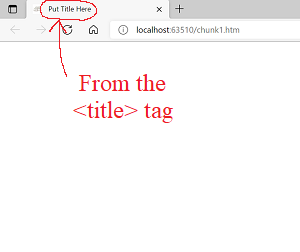
For example, in the Code Chunk 1 image,
you can see the title tag content displayed
in the browser's title bar.
According to MDN Web Docs:
-
title tag goes inside head container (if you have one)
If you use a<head></head>container, then the title tag must go inside the head. With no head container, it can go anywhere inside the body container. -
title tag content is text only; character codes allowed
Title tag content must be text-only; the browser decides how the text is displayed. In particular, you can't adjust the text appearance with CSS styling (likefont-weight:bold;) or HTML tags (like<em></em>). You can, however, use HTML character codes (like ‘—’ ) to get special characters. -
SEO (Search Engine Optimization)
Title tag content is important for SEO, and is used as a ranking factor for search engine results. Longer (well-written) titles perform better—but don't exceed about 55–60 characters, since browsers might not show additional text beyond that. Title tag content identifies the page in search engine results. -
favorites/bookmarks
Title tag content typically identifies the page in a browser's ‘Favorite’ or ‘Bookmark’ lists.
Body Container
(8), (9), (10):
The <body></body> container tag
holds all the web page contents—stuff that users will see (like
headings, paragraphs, images, tables, lists),
click (like links), and interact with (like forms).