Page 1: Responsive Web Page Tutorial, HTML/CSS Only
Page 2: Page Structure using Flexbox and a Media Query
Page 3: Footer (nested flexboxes)
Page 4: Header (menu/search toggles, transition effects)
Page 5: Sticky Aside
Page 6: Make it Beautiful
Page 7: JavaScript Efficiencies, Breadcrumbs, Cats, Audio and More
Page 8: Embedded Note from Creator and Floating Hearts
Page 9: Move On To, Video Tutorial
Page Structure Using Flexbox and a Media Query
Let's get some content in our page! The overall page structure is discussed next; Flexbox and a Media Query will make it responsive.
The page structure has three primary sections—header, footer, and the stuff in between:
- Header and footer are discussed in detail later on; only ‘placeholders’ appear here.
-
The stuff in between has two subsections:
- an ‘aside’ to hold in-page navigation
- the primary page content
Design for Mobile First
Rule of thumb: Code for good performance on small screens first, and then adjust
to take advantage of larger screens.
In narrow applications, the contents should stack.
Code Chunk 2 (below) goes inside the <body></body> of
Code Chunk 1.
                    <header>HEADER</header>

                    <div id="asideMainContainer">

                      <aside>

                        <nav class="asideNav">

                          <a class="asideNavLink">link1</a><br />

                          <a class="asideNavLink">link2</a>

                        </nav>

                      </aside>

                      <main>PRIMARY PAGE CONTENT</main>

                    </div>

                    <footer>FOOTER</footer>
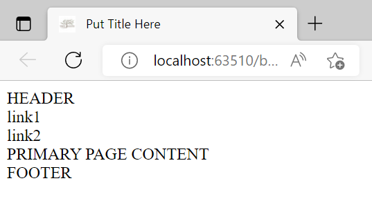
placeholders
Comments on the Code:
Below is the ‘tree’ for the newly-added code. Code indentation helps you see the structure: tags at the same level are indented the same amount.
body |
||||||||||||||||||||||
| / | | | \ | ||||||||||||||||||||
header |
div |
footer |
||||||||||||||||||||
|
Structure (HTML) Versus Presentation (CSS)
HTML should describe structure (function/purpose).
CSS should describe presentation.
For a given structure, many different presentations might be used.
For example, use <em></em> (HTML) to emphasize text.
Use CSS to decide how it should be emphasized: bold, italicized, different color/size, animated, more.
As much as possible, keep HTML and CSS separate.
Semantic Elements, Divs, Id, Class
Semantics is the study of meaning.
HTML Semantic Elements
clearly describe their meaning to both browser and developer. For example, a quick glance tells you the
purpose of header, aside, nav (for navigation),
a (for anchor),
main, and footer in the HTML document.
Use <div></div>
(for division)
as a generic container: it groups content when no semantic element seems appropriate.
Use id="blah" to identify a unique tag in HTML code.
Since there is exactly one container between the header and footer, id="asideMainContainer" is appropriate.
Use class="blah" when more than one tag may require the same treatment.
There may eventually be more than one navigation group in the aside section, so
class="asideNav" is appropriate.
Can I Use?
Different parts of HTML and CSS have different levels of support. If you know the browsers/devices
that your audience prefers, and want to be sure that your code won't break for them, then
Can I Use ... ? is an extremely valuable resource.
Type in an HTML tag name (like
‘details’) or a CSS property (like ‘rotate’) and see if you have
GREEN
in the required places!
Add Styling to Better Understand the Structure
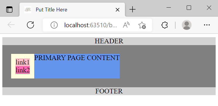
The red items (above, in Code Chunk 2) are placeholders for the various
sections/links, and appear as visible text in the output.
However, some tags in Code Chunk 2
are block-level elements,
whereas others are inline-level elements.
Block-level elements start on a new line and fill the entire horizontal space of their parent.
Inline-level elements do not start on a new line (although <br /> can be used to force a line-break),
and occupy only as much horizontal space as their content requires.
Styling helps to see the difference:
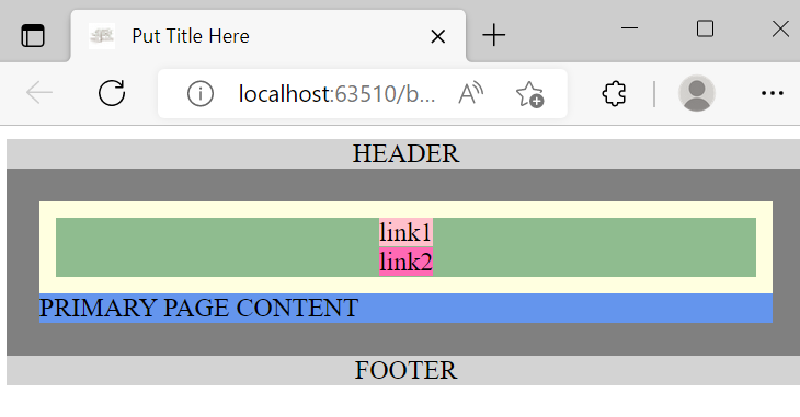 Code Chunk 2, with CSS styling
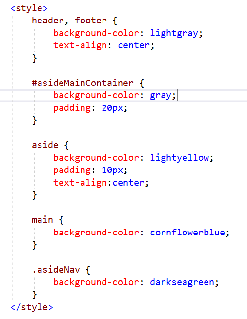 CSS Styling for Code Chunk 2
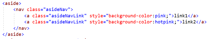 Inline CSS Styling for Code Chunk 2
Notes on CSS Styling:
- The
<style></style>container goes inside the<head></head>. - To style an
id, use the pound symbol ‘#’ (like#asideMainContainer). - To style a
class, use a period (like.asideNav). -
Padding takes the background-color of its element.
Without padding, an inner container's color can overlap an outer container's color, rendering the outer container invisible.
Notice the 20px of gray padding on#asideMainContainer. Remove it, and you won't see any gray color!
Notice the 10px of lightyellow padding onaside. Remove it, and you won't see any lightyellow color!
Turning the Structure into a Flexbox
In wider applications, the aside section should move to a narrow left bar.
Flexbox and a media query will make this happen!
Flexbox is a one-dimensional layout method for arranging items in rows or columns, where items can easily expand to fill additional space or shrink to fit into smaller spaces. Flexbox has tremendous capabilities—you may want to skim through this flexbox tutorial. Here, we mention only what is needed for our simple page.
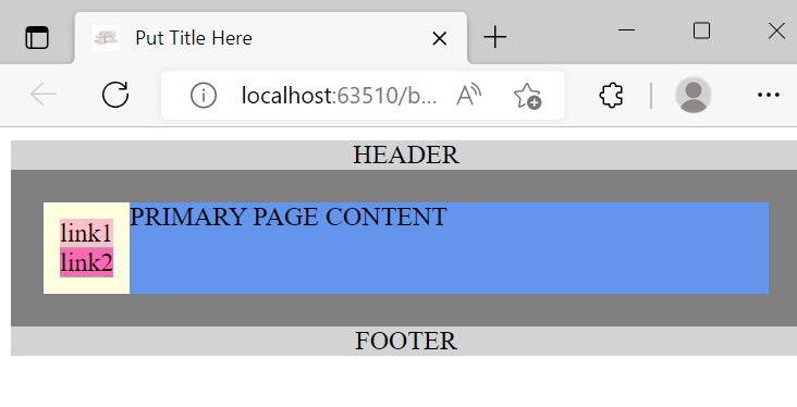
To begin, turn asideMainContainer into a flex container, by adding this line of CSS styling
to #asideMainContainer:
display: flex;
With this single line, the children aside and main
are automatically transformed into
flex items.
The default direction for laying out flex items inside a flex container is a row, so the page now
renders like this:
 Make
Make asideMainContainer into a flexbox;the default direction for the flex items is a row
Note:
the darkseagreen background
of asideNav is no longer visible (click for details):
aside the minimum width required for its contents.
If you want to see some darkseagreen around the links,
then add some padding to asideNav.
Already, this looks much like what we want on a wider page!
However, the main div should use any available extra page width.
To accomplish this, add the line
flex-grow: 1;
to the CSS for main.
This (roughly) says: ‘assign 100% of all extra width to main’.
This is closer to the truth (click for details):
flex-grow is 0, hence this value is assigned
to aside. Then:
$$\begin{gather}
\text{sum of flex-grow for all flex items} = \overbrace{0}^{\text{aside}} + \overbrace{1}^{\text{main}} = \color{red}{1}\\
\text{extra horizontal space assigned to aside} = \frac{0}{\color{red}{1}} = 0\\
\text{extra horizontal space assigned to main} = \frac{1}{\color{red}{1}} = 1 = 100\%
\end{gather}
$$
Now, we have the desired layout for wider screens:
Remember, however, that we're designing for mobile first.
To return the layout to a single column for smaller screens, add this CSS line to
#asideMainContainer:
flex-direction: column;
Use a Media Query to Change Layout for Wider Screens
I prefer to switch to a two-column layout at 600 pixels. This keeps a single column for most phones, but uses two columns for tablets and wider. To achieve this, we'll use a media query.
A media query gives a way to apply CSS only in a specified situation.
Add the CSS that is circled below, after the CSS for #asideMainContainer.
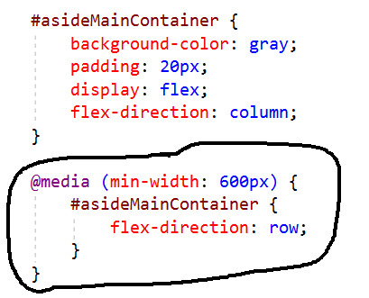
Caution: Media queries must go after the CSS for the tag(s) they change (click for details):
#asideMainContainer CSS,
it won't work. The (incorrect) logic would be:
- For screen sizes 600px or greater, use:
flex-direction: row; - Always use:
flex-direction: column;
By putting the media query after the
#asideMainContainer CSS, the (correct) logic is:
- Start by using:
flex-direction: column; - For screen sizes 600px or greater, use:
flex-direction:row;
Notes on the media query:
@mediabegins every CSS media query.-
The rules (inside parentheses) identify when the media query should be applied.
Here,(min-width: 600px)says (roughly): ‘Use the new CSS when the device has a minimum width of 600 pixels; that is, when the width is greater than or equal to 600px.’ -
The new CSS goes inside curly braces:
{new CSS}
Put as much or as little CSS inside the curly braces as you need!
With the media query in place, the web page now responds automatically to different widths. Try it out!
See how the page looks on lots of different devices: Responsinator
Re-validate the page to check that you're still using best practices.