http://fishcaro.crosswinds.net/day_22_inputs_for_forms.htm
INPUT tag. You will need 3 index cards (6 sides) for
today's lesson.
FORM container. Be sure to give
the form a name, like this:
<FORM NAME="name_of_form"> all the form contents </FORM>
INDEX CARDS #22:
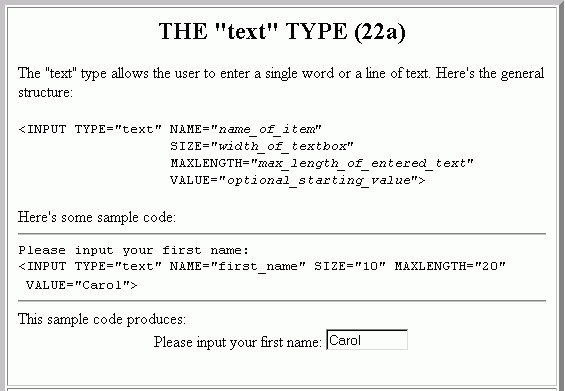
THE "text" TYPE (22a)Please input your first name:
This sample code produces: |
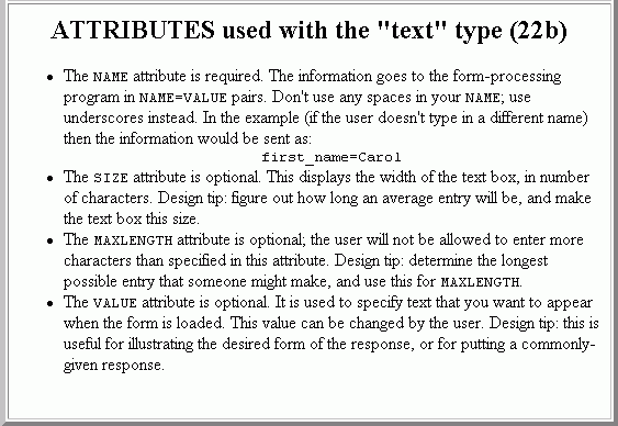
ATTRIBUTES used with the "text" type (22b)
|
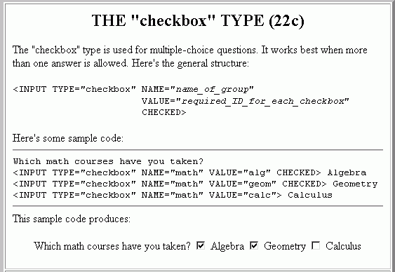
THE "checkbox" TYPE (22c)Which math courses have you taken?
This sample code produces: |
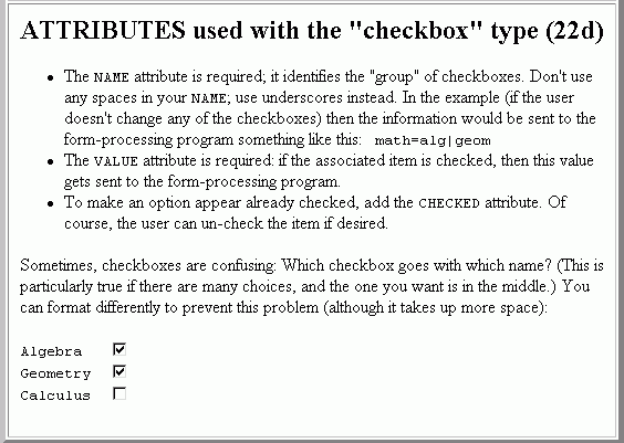
ATTRIBUTES used with the "checkbox" type (22d)
Algebra Geometry Calculus |
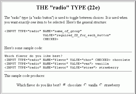
THE "radio" TYPE (22e)Which flavor do you like best?
This sample code produces: |
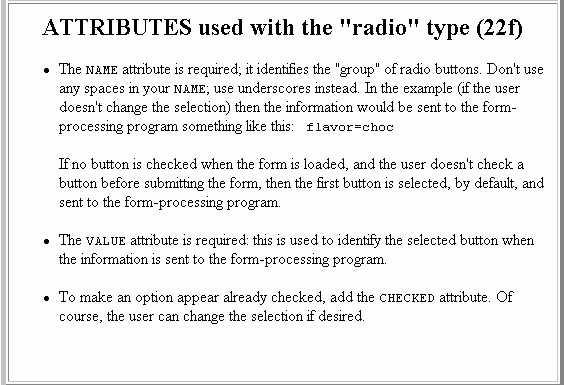
ATTRIBUTES used with the "radio" type (22f)
|
Printable version of Index Card 22a
Printable version of Index Card 22b
Printable version of Index Card 22c
Printable version of Index Card 22d
Printable version of Index Card 22e
Printable version of Index Card 22f
WORKSHEET #22:
ASSIGNMENT #22: