A TABLE is a collection of cells, arranged in rows (horizontal) and columns (vertical).
The <TABLE> </TABLE> container holds all the
necessary information.
The BORDER attribute is optional: <TABLE BORDER> When used, it puts a border around each cell,
so you can see the structure of the table.
Each row is created using using a <TR> </TR> (Table Row) container tag.
Within each row, each "cell" is created using a <TD> </TD> (Table Data) container tag.
The basic markup for a table is: <TABLE BORDER>
<TR>
<TD>table data: first row, first cell</TD>
<TD>table data: first row, second cell</TD></TR>
<TR>
<TD>table data: second row, first cell</TD>
<TD>table data: second row, second cell</TD></TR></TABLE>
This code would produce:
table data: first row, first cell
table data: first row, second cell
table data: second row, first cell
table data: second row, second cell
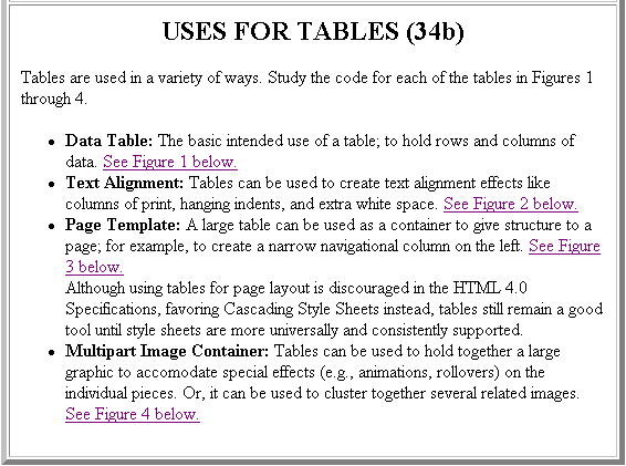
USES FOR TABLES (34b)
Tables are used in a variety of ways. Study the code for each of the tables in
Figures 1 through 4.
Data Table: The basic intended use of a table; to hold rows and columns of data.
See Figure 1 below.
Text Alignment: Tables can be used to create text alignment effects like columns of print, hanging
indents, and extra white space.
See Figure 2 below.
Page Template: A large table can be used as a container to give structure to a page; for example,
to create a narrow navigational column on the left.
See Figure 3 below.
Although using tables for page layout is discouraged in the HTML 4.0 Specifications, favoring Cascading Style
Sheets instead, tables still remain a good tool until style sheets are more universally and consistently supported.
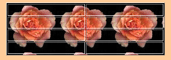
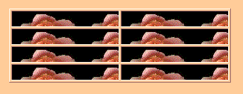
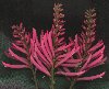
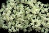
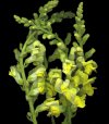
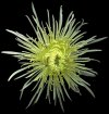
Multipart Image Container: Tables can be used to hold together a large graphic to accomodate
special effects (e.g., animations, rollovers) on the individual pieces. Or, it can be used to cluster together
several related images.
See Figure 4 below.
FIGURE 1. DATA TABLE
TITLE OF TABLE
1st Column Heading
2nd Column Heading
3rd Column Heading
cell #1
cell #2
cell #3
a red cell right-aligned
a green cell left-aligned
a purple cell centered
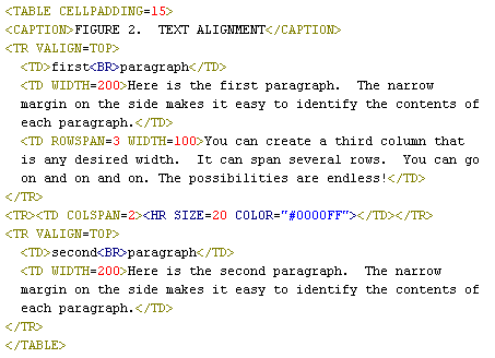
FIGURE 2. TEXT ALIGNMENT
first paragraph
Here is the first paragraph. The narrow
margin on the side makes it easy to identify the contents of
each paragraph.
You can create a third column that
is any desired width. It can span several rows. You can go
on and on and on. The possibilities are endless!
second paragraph
Here is the second paragraph. The narrow
margin on the side makes it easy to identify the contents of
each paragraph.
FIGURE 3. PAGE TEMPLATE
TABLE OF CONTENTS:
(Each section is a link)
Section 1
Section 2
Section 3
The left-most column is for navigational purposes.
It is 25% of the available width.
The second column is the main section. It is 50% of
the available width.
The third column can be for ADVERTISEMENTS! It is 25% of
the available width.
ADVERTISEMENT!
ADVERTISEMENT!
ADVERTISEMENT!
FIGURE 4. MULTIPART IMAGE CONTAINER
I got the flower pictures from:
http://www.geocities.com/TheTropics/Island/6801/mark/marks.html (link is no longer valid)
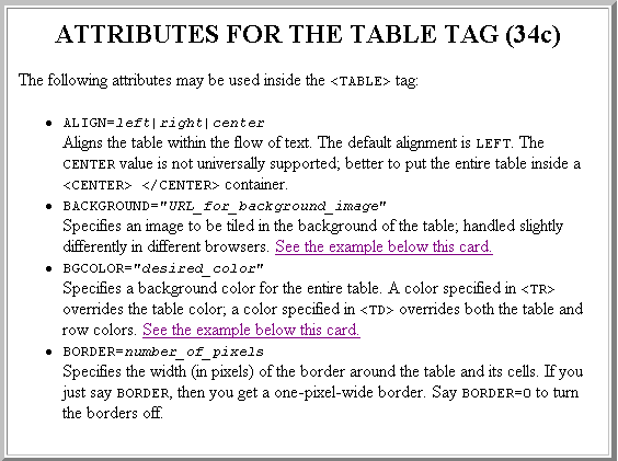
ATTRIBUTES FOR THE TABLE TAG (34c)
The following attributes may be used inside the
<TABLE> tag:
ALIGN=left|right|center
Aligns the table within the flow of text.
The default alignment is LEFT. The CENTER value is not universally supported;
better to put the entire table inside a <CENTER> </CENTER>
container.
BACKGROUND="URL_for_background_image"
Specifies an image to be tiled in the background of the table; handled slightly differently in
different browsers. See the example below this card.
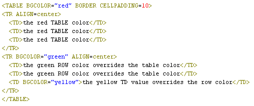
BGCOLOR="desired_color"
Specifies a background color for the entire table. A color specified in <TR> overrides the table
color; a color specified in <TD> overrides both the table and row colors. See the example
below this card.
BORDER=number_of_pixels
Specifies the width (in pixels) of the border around the table and its cells. If you
just say BORDER, then you get a one-pixel-wide border. Say BORDER=0 to turn the borders off.
Here's a sample table with a background tiling, as viewed in both Internet Explorer
and Netscape Navigator. Very different effects!
In Internet Explorer, the image tiles behind the entire table.
In Netscape Navigator, the image tiles in each individual cell.
What does it look like in YOUR browser? (Check below...)
Study the code that produced this table. What colors do you get?
the red TABLE color
the red TABLE color
the red TABLE color
the green ROW color overrides the table color
the green ROW color overrides the table color
the yellow TD value overrides the row color
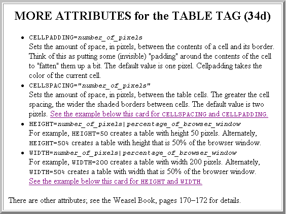
MORE ATTRIBUTES for the TABLE TAG (34d)
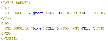
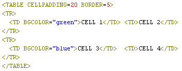
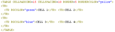
CELLPADDING=number_of_pixels
Sets the amount of space, in pixels, between the contents of a cell and its border.
Think of this as putting some (invisible) "padding" around the contents of the cell
to "fatten" them up a bit. The default value is one pixel. Cellpadding takes the
color of the current cell.
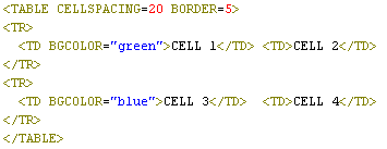
CELLSPACING="number_of_pixels"
Sets the amount of space, in pixels, between the table cells. The greater the
cell spacing, the wider the shaded borders between cells. The default value is
two pixels. See the example below this card for CELLSPACING and CELLPADDING.
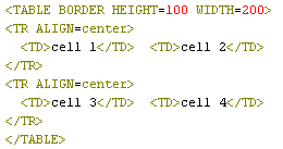
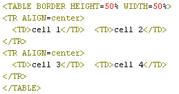
HEIGHT=number_of_pixels|percentage_of_browser_window
For example, HEIGHT=50 creates a table with height 50 pixels.
Alternately, HEIGHT=50% creates a table with height that is 50% of the browser window.
WIDTH=number_of_pixels|percentage_of_browser_window
For example, WIDTH=200 creates a table with width 200 pixels.
Alternately, WIDTH=50% creates a table with width that is 50% of the browser window. See the example below this card for HEIGHT and WIDTH.
There are other attributes; see the Weasel Book, pages 170–172 for details.
CELL 1
CELL 2
CELL 3
CELL 4
This uses the default values for cellspacing (2 pixels), cellpadding (1 pixel),
and border (1 pixel).
CELL 1
CELL 2
CELL 3
CELL 4
Here, CELLPADDING is set to 20 pixels; BORDER is set to 5 pixels.
Note that the "padding" around the cell contents takes the color of the cell.
CELL 1
CELL 2
CELL 3
CELL 4
Here, CELLSPACING is set to 20 pixels; BORDER is set to 5 pixels.
Note the wide shaded borders between the cells.
CELL 1
CELL 2
CELL 3
CELL 4
A combination: CELLPADDING=15,
CELLSPACING=10, and BORDER=5.
In Internet Explorer, BORDERCOLOR="desired_color" can be used
to specify the color of the table border.
Here is an example illustrating the HEIGHT and WIDTH attributes.
Re-size your browser window; what changes? What doesn't change?
cell 1
cell 2
cell 3
cell 4
The table above won't change size as the browser window is re-sized. It has
a fixed height of 100 pixels and a fixed width of 200 pixels.
cell 1
cell 2
cell 3
cell 4
The table above will change size as the browser window is re-sized. Its height
and width will remain 50% of the browser window.
(W34.1) Please read Chapter 5 (Structural Effects), and take the quiz at the end of Chapter 5:
http://www.cwru.edu/help/wilbur/ (link is no longer valid)
This is mostly review material; skim through it before going on to Chapter 6 (Tables).
There is one new thing:
Pay particular attention to how you can right-align a paragraph (like this).
(W34.2) Then, read Chapter 6 (Tables), and take the quiz at the end of Chapter 6:
http://www.cwru.edu/help/wilbur/ (link is no longer valid)
ASSIGNMENT #34:
(A34.1) Please read page 168, and pages 176–178 (from "Introduction to Tables" up to
"Table level controls") in the Weasel book.
(A34.2) Incorporate a basic table in your homepage.
(A34.3)Click here to bring up a TABLE worksheet. This worksheet
will give you practice with borders, cellpadding, cellspacing, COLSPAN and ROWSPAN. Print out the worksheet,
then (without looking!) write the code to duplicate the worksheet!
(A34.4)Click here to bring up another TABLE worksheet. This worksheet
will give you practice with table headings, horizontal and vertical alignment in cells, setting height and width for a table,
and setting height and width in individual cells. Print out the worksheet,
then (without looking!) write the code to duplicate the worksheet!


